:quality(80)/f/93161/2084x1506/b2181f3c40/featlogohope.png)
Breaking the NES
Shovel Knight is a game that embraces the look of NES classics, but has some major differences when examined closely. When setting out to develop the game’s aesthetic and play style, we at Yacht Club Games had a few goals in mind. Instead of emulating the NES exactly, we would create a rose-tinted view of an 8-bit game.
/f/93161/1920x1080/13c95a19c5/featuredcardsk.png)

In case you missed it, this is a reposting of an article we wrote for Gamasutra. Check out the original here!
Shovel Knight is a game that embraces the look of NES classics, but has some major differences when examined closely. When setting out to develop the game’s aesthetic and play style, we at Yacht Club Games had a few goals in mind. Instead of emulating the NES exactly, we would create a rose-tinted view of an 8-bit game.
What if development for the NES never stopped? How would an 8-bit game feel and play if developed today? We imagined the gameplay would benefit from modern design lessons, and the tech would receive subtle but substantial upgrades. This was possible to an extent on the NES, where technology was built into the cartridges.
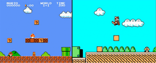
Later NES games like Super Mario Bros. 3 packed cartridge tech that was vastly improved from early NES titles like the original Super Mario Bros. Different chipsets allowed for features like diagonal scrolling, larger sprites, or (unique to the Japanese Famicom, as detailed below) additional sound channels. Compounded with improved techniques and understanding of the hardware, the difference between early and late-life NES games can be staggering.
We imagined that perhaps some cartridge advancements would allow for the techniques displayed in Shovel Knight. We also broke some NES limitations purely out of preference… we decided to eliminate any drawback that would hamstring the gameplay experience. One example is sprite flickering, which occurred when the NES tried to display more than 8 sprites per horizontal line. This effect is nostalgic for some, but we felt it was detrimental, so we nixed it. However, we did make gameplay design decisions based on the idea of sprite flickering: we tried to avoid cluttering the screen with onscreen objects, and limited things like particle effects. Being aware of the rules in this case led to the game feeling clear and simple; one of the hallmarks of a great NES game.
There are many more examples, so let’s go into more detail on how we bent the rules of the NES!
How We Broke It!
Modern Hardware! Console and PC Versions! We aren’t on the NES!
Shovel Knight runs natively on modern hardware, and cannot run on NES hardware. This surprised some people who took our NES intentions quite literally, with some players hoping to play Shovel Knight on a homebrew NES flash cartridge.
The truth is that Shovel Knight is quite a complex game, capable of running on many hardware platforms and configurations. On the current-gen Nintendo platforms, Shovel Knight supports some unique wireless and internet features using Nintendo’s Miiverse and Streetpass functionality. Third party middleware like FMOD audio and SDL controller support were also integrated.
Widescreen 16:9 display (or 5:3 on the 3DS)
Part of our modern upgrade was extending the viewable screen space, avoiding the black bars you would see in an NES virtual console game. This meant displaying our game at the 16:9 resolution native to most modern displays. While we did change our aspect resolution, we didn’t change the resolution in terms of making Shovel Knight a pixel-dense HD game.
Instead, each Shovel Knight pixel is really 4.5×4.5 pixels at 1080p, giving a virtual resolution of 400×240. An NES outputs at 256×240, giving us the same viewable vertical resolution. Our background tiles (like most NES games) are 16×16 in size, and we have the same number of vertical tiles as an NES game. Keeping the vertical and tile size dimensions were important to us in order to match the gameplay feel of NES titles. The only difference is additional horizontal space, which we thought was a great addition, allowing extra room in level design for puzzles, objects, and breathing room.
Background parallax
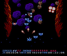
Background parallax scrolling is the ability to shift different layers or parts of the screen at different rates, giving 2D layers the appearance of 3D movement. Imagine watching out the side window of the car on a highway: the mountains far away don’t appear to move at all, while the posts whiz by very quickly. The beginning of our first trailer gives a taste of the effect. This advanced effect is much more typical of the SNES. It was possible on the NES, but only with a lot of trickery. Programmers had a couple of options:
Make sure no parts of the background intersected and scroll them in only one direction: Non-intersection in Shatterhand
Create an animated tile of a background scrolling at a different rate: Animated Tiles in Metal Storm
Non-intersection in the background and sprites in the foreground in Batman
Early on with Shovel Knight, we decided to amp up the parallax scrolling, creating an average of 5-6 layers of backgrounds to scroll by. This felt like the next technological step the NES would make so it didn’t feel out of place to us. More importantly, adding the effect made the gameplay layer more readable. There was another great benefit to having so many layers: we could really take advantage of the 3DS’ eye-popping stereoscopic effects!
Summer Carnival ''92 Recca displaying its sprite count prowess
Sprite flickering on the NES would occur when more than 8 sprites were displayed on the same horizontal line. We kept the sprite count as low as we could, but as previously mentioned, we didn’t sweat the exact numbers. Some of our objects produce a few more particles than an NES game would dare… but we thought it was worth the beauty.
Some games like Recca or Contra got around sprite limits by displaying certain sprites only every other frame (at 30fps instead of 60fps). On CRT monitors running low resolution interlaced video, objects would appear to be drawn every frame. In addition to this, NES particle art was often built with flickering in mind for effects like explosions. We used flashing sprites in some situations to replace alpha transparency; For example, Shovel Knight flashes on and off during his “invincible” state, after being hit. So overall, this didn’t feel like an important restriction to follow, unless it made the gameplay not feel like NES gameplay.
Color palette Additions
The NES was only capable of spitting out 54 different colors… and that’s not a lot. The problem for us mainly came in trying to display a gradient in most hues. For example, there isn’t a very useful yellow, the darker spectrum of color is very underrepresented, and there aren’t many shades that work for displaying a character with a darker skin tone. Sticking to the NES palette was a big priority for us, though, as it gives a very distinctive look. In the end, we ended up with only a few extra colors.
For more info on NES colors, check out this wiki: http://en.wikipedia.org/wiki/List_of_video_game_console_palettes#Famicom.2FNE
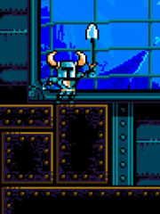
The dark purple used here is #22123B
So what are the colors of our shame? In this shot from Treasure Knight’s stage, you can see the dark purple details in the ground. Once added, this purple was used elsewhere, mainly as a bridge between black and the cooler colors of any given background.
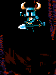
This deep red hue is #360900
Similarly to the purple, we needed a color to bridge the gap from black to our warmer colors. This dark red shows up prominently in Mole Knight’s stage, The Lost City. You won’t see this red as commonly used as the purple, because the NES palette leans heavily toward cool colors. Famously, Mega Man was conceived of as a red robot, but was changed to blue after the developers saw the spectrum.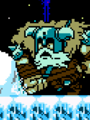
The beige that colors Polar Knight's skin and woolly cloak is #9E9E5C
This next cheater color was actually the first created. We needed a color for the sheepskin cloak that Polar Knight wears and none of the colors in the NES palette really fit the bill. This beige is also used for his skin and to keep things in theming with the rest of the level. We actually intended to go back and fix this beige since it is the only place in the whole game that it’s used, but nothing we tried ever worked. In the end we just decided to leave it.
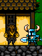
This fellow handsomely sports the cheater color #824e00
The final cheater color was needed to help make the cast of Shovel Knight more diverse. The default NES color palette provides very few tools to create a character with darker skin tones. This was especially problematic when doing the “Pixel My Face” Kickstarter rewards (at a certain pledge tier, backers are immortalized as portraits in the game) since we had backers from all corners of the earth. So our final cheater color is the light brown that gives shade to this fellow’s face!
Number of colors per sprite
Sprites on the NES were limited to 4 colors (or 3 colors + transparency) as you can see with the sprite characters in The Legend of Zelda screenshot on the right.
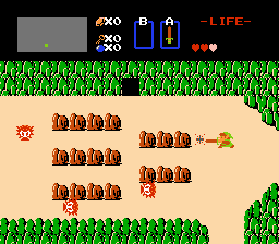
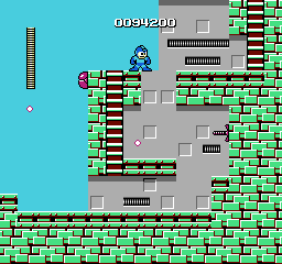
Some developers created more colorful sprites using another trick. Characters like Mega Man were constructed out of two sprites, one for his body (blue, light blue, and black) and one for his face (beige, white, and black), and the sprites were overlaid. This is why Mega Man’s face will flicker separately from his body sometimes. For Shovel Knight, we decided to treat most sprites like Mega Man, and give them 4-5 colors to work with in addition to transparency.
Getting this balance right was a tricky process, as a character with too many colors stuck out like a sore thumb. We worked back and forth with detail levels and colors until we found a combo that looked great.
A sprite too detailed is also really hard to animate!
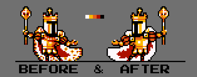
In this example, you can see the original King Knight design. While the left sprite has only 5 colors (as was our stated limitation), it was too detailed and almost felt closer to a 16 bit sprite. After taking a few passes to simplify the shapes for readability and simplicity, we ended up with the sprite that you see in game!
Uniform color palette

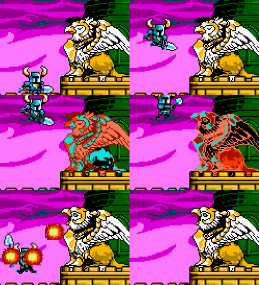
Although every sprite in Shovel Knight is created using limited colors, we didn’t make all sprites onscreen abide by a single color palette. To cite Mega Man again as an example, the player’s sprite color changes also affect 1-Ups and other items. This is due to a uniform color palette; when a color is adjusted for one sprite, all sprites change color. We chose to not worry about this limitation as the headache to make one palette work doesn’t benefit gameplay, but we did use limited color palettes to create enemy variants and for cycling damage and explosion effects.
Those effects made gameplay more clear and exciting; for example, cycling damage made it obvious you were hurting an enemy as the effect was consistent across all objects and added fun as the color cycling was more impactful than your typical ‘gethit’ animation or flickering. These palette cycling and shifting effects were created by passing an indexed unsigned byte texture representing the sprite and a full 32 bit color texture representing the palette to a pixel shader…quite the leap from 8-bit technology to imitate the good old days!
To see the limits of palette effects, check out this site, which shows the amazing animations you can create by cycling a single color palette.
Memory limitations
An NES cart could only hold so much information: code, animations, backgrounds, text, music, and everything else had to fit into 32k of memory, although this was expanded greatly through the use of on-cartridge chips called memory mappers, which became essential as more advanced graphics and special effects required ROM sizes as large as 4-6 megabits (0.5 ~ 0.75 MB). Shovel Knight weighs in at almost 1.2 gigabits (about 150 MB – most of which is .mp3s). Because we didn’t have to fit onto a small cartridge, the extreme optimization and data compression required for that wasn’t necessary, and we were able to focus our technical efforts on gameplay systems and stability.
Our composer and sound designer Jake ‘Virt’ Kaufman likes to remind us that the soundtrack, when compiled into authentic machine code (see below) will fit nicely into the 6 megabit Kirby’s Adventure cartridge, but only if all graphics and gameplay code are removed first.
Big sprites
The sprite hardware on the NES was not optimal for drawing very large moving objects, due to the limitations it imposed (after all, even a few small ones could cause flickering). To get around this limitation, clever developers displayed big art as animated background tile layers. That is the reason why, whenever you fight a large enemy on the NES, they are usually on a black screen with no background art. The boss is the background.
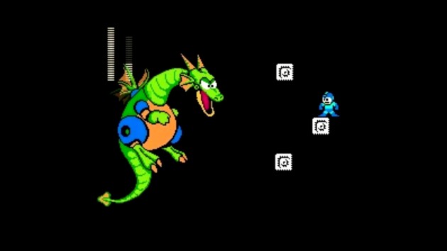
We thought that the black background with the huge boss always gave NES games a distinctive and epic feel, where the focus was just on you and your enemy, so we decided it was important to keep. However, lacking sprite limitations, we didn’t need to mess with background layers or other workarounds to make a large sprite possible. We simply used our animated sprite code, were careful with the designs, and made sure the sprite was on a black (or very dark) background.
Camera shakes
Shaking the camera to show a powerful rumble is a time-honored videogame effect. On the NES, camera shakes only occurred on a single axis. Pay attention next time you see Bowser smashing the ground in the final encounter in Super Mario Bros 3 . This has to do with the NES’s difficulties doing diagonal scrolling. And this is something we broke, because we didn’t find a compelling reason to keep it.
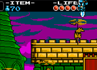
Notice how Shovel Knight overlaps the HUD's health bar
HUD as a layer
One oddity of NES games is that sprites usually draw in front of the HUD. On the NES, most HUDs were drawn on the background layer. This is because there was only 1 layer, so the background and HUD had to share. In many cases, the memory mapper chips that enabled large ROM sizes also contained special timing hardware to support “split screen” status bars, but the background layer was still just a background, and sprites were drawn over it. So, if the player was able to reach the top of the screen, the HUD would be covered up by their sprite. Occasionally, this behavior was used as a gameplay mechanic, as secrets or paths could be hidden in such “unreachable” screen space. We love this quirk, and stuck to it as best we could, but sometimes the layering got too weird, and we had to change a few instances on a case by case basis.
Sound limitations

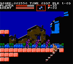
The music is probably the most authentically NES part of Shovel Knight, although it might seem more lush and full than you’d expect for a NES game. That’s because it is written to use a special memory mapper / sound chip called the VRC6, which was used in several Konami games toward the end of the NES era. This chip allows for advanced graphical techniques, but most famously adds 3 additional sound channels, giving the music much more richness and depth. However, external sound chips such as the VRC6 only worked on the Japanese Famicom, as the Western NES lacked the necessary cartridge connections, so it’s an unfamiliar sound to most western gamers. Compare the music in the US version of Castlevania III with the Japanese release, Akumajou Densetsu; the difference is striking.
Composer Jake Kaufman went about creating Shovel Knight’s music and sound effects using a freely available program called Famitracker. Famitracker exports music in NES machine code, which is capable of running on an actual NES or Famicom console, with all of its limitations and hardware quirks. We finalized the audio using mastering tools (EQ and compression) to give it some extra punch on today’s sound equipment, but avoided using reverb effects or stereo mixing, which would destroy the raw character of the sounds. Any echoes or special effects you hear are programmed note-by-note, the way they were on the NES. Here’s a video of Jake demoing the complexities of a couple tracks created in Famitracker for Shovel Knight.
Another limitation of the NES was that sound effects would often cause one of the audio channels to drop out. The NES shared the same 5 basic channels for both music and sounds, so the SFX would temporarily steal one or more of the music channels in order to be played. This effect is not present in Shovel Knight – the sound effects are simply layered on top of the music, which is completely inauthentic, but much nicer to listen to.
The next time you boot up an NES game, though, listen closely and notice how most games will drop out the bass, drums, or harmony to the melody in order to pack in more sound effects.
We broke the NES!
When you add up all the changes, it seems like there is a vast gulf between Shovel Knight and the technology of the NES. However, we feel that the core of the aesthetics of the 8-bit era has been respected, and perhaps even enhanced!
Shovel Knight was a dream project, allowing us to explore a style of game that’s rarely seen today. It was fascinating to try and problem-solve the technical issues of yesteryear while avoiding any pitfalls that would belie real modernity. We hope that by being true to the NES in more than just superficial ways, we’ve built fanciful rock-solid fundamentals.

