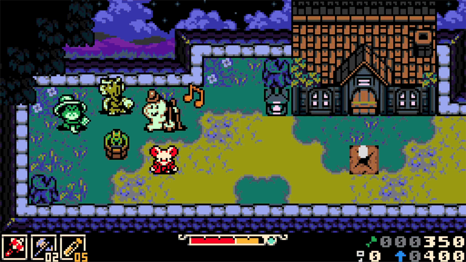
THE ART OF THE GAME
Great care is being taken to make Mina the Hollower look and feel as authentic to its inspirations as possible and remain a fresh and exciting new adventure. Here's how we did it!
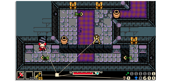
/f/93161/1920x1080/9dc5817617/artofthegame_featuredimage.png)
DISCLAIMER: This article was originally posted on Feb, 24, 2022 as a Kickstarter update. Images used are no longer representative of the current state of Mina the Hollower.
It's no secret that we're huge fans of retro games and pixel art as a medium. Today, we wanted to expand a bit more on Mina the Hollower’s art style. We'll go over what inspired it, why we chose this direction, and how we're applying Game Boy Color (GBC) hardware limitations while still making a modern game.
Just as Shovel Knight sought to imagine a world where early home console aesthetics never stopped being refined, Mina the Hollower aims to do the same for the world of portable gaming. We’ve taken great care to faithfully craft an authentic 8-bit aesthetic, and we hope it shows!
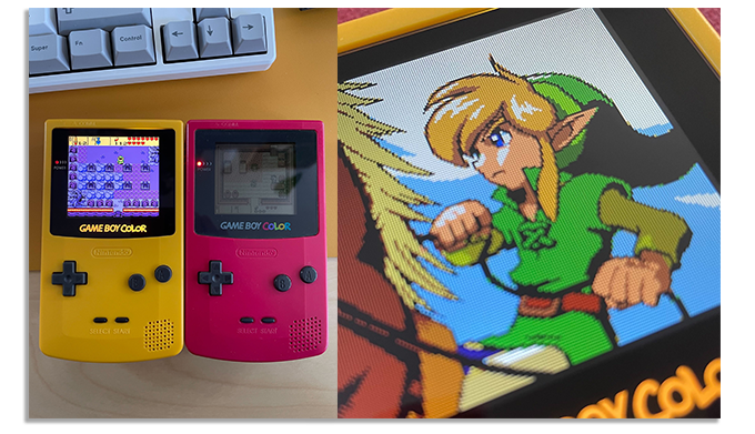
Why choose the GBC aesthetic for our next game?
Everything about Mina the Hollower, from gameplay to visuals, takes inspiration from a veritable pantheon of portable games and consoles, especially the games and presentation found on Nintendo’s Game Boy and Game Boy Color.
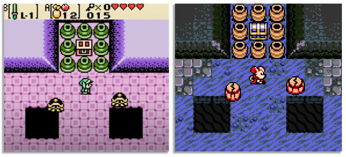
The Legend of Zelda: Oracle of Seasons showcases some of our favorite art on the console.
We love classic games and pixel art (that’s a big part of why we made Shovel Knight!), but we especially love handheld games. There’s something intimate about playing a handheld game, like you are peering into a little world all of your own. These games delighted us as kids, and still delight us as adults. Even as dedicated portable gaming consoles like the 3DS and Vita fade further into memory, we found ourselves drawn toward a project that celebrates the heyday of portable gaming.
That said, our goal has never been to build an actual game for the Game Boy Color hardware, but to create something that looks and feels like our rosiest-tinted memories of that era. A next-gen Game Boy Color game, if you will!
What exactly does it mean to be a next-gen Game Boy Color game?
In much the same way we developed Shovel Knight—a game heavily inspired by NES titles of old—we're willing to break limitations for the sake of making a game that looks and feels fun and modern. That said, we still want to pull at your nostalgia strings a little!
So, how do we decide what that means? Where do we draw the line between retro and modern for a game so heavily inspired by yesteryear? Let's break it down a little.
OPTIMIZED PERFORMANCE
Mina the Hollower may be inspired by the Game Boy Color, but it certainly couldn't run on one! We're using modern tools to make the game, which just makes our lives easier all around. Under the hood, Mina the Hollower draws textured triangles, not sprites - in terms of how it actually works it's closer to modern games like Tears of the Kingdom than Link's Awakening.
The game runs at 60 frames per second, which we feel is necessary these days to make gameplay feel as smooth and polished as possible. We want players to feel like they have full control of their character so, ideally, death never feels like the game is cheating the player out of their experience. The game also makes use of more buttons than the Game Boy ever had available, which allows us to ramp up the number of abilities the player has at their disposal.
COMPACT RESOLUTION
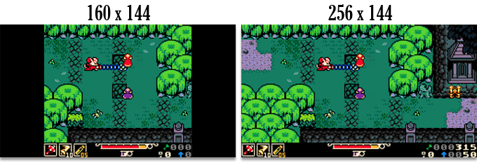
The game is built at a widescreen resolution rather than the 10:9 of Game Boy, which is charming, but unless you're one of the few gamers still playing on an old CRT, you’ll find that all TVs and monitors are widescreen these days.
The Game Boy’s screen resolution was a tiny 160x144. Mina’s is a wider 256x144. This resolution (smaller than Shovel Knight!) gives a close-up view at the expense of screen real estate. Each pixel is very impactful!
FOCUSED TECH
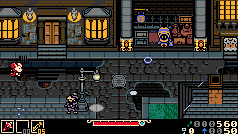
Mina features sprite art in its purest form! That means no 3D, no anti-aliasing shaders, and very specific use of programmatic scaling or rotation. We are avoiding anything that would look anachronistic on a classic, 8-bit handheld console.
A few concessions we've made are in adding visual enhancements that were new to this generation of gaming hardware or were becoming used more frequently. Things like parallax scrolling, which allows layered background assets to scroll in time with the player's camera motion, providing unparalleled depth in 2D space.
We've also tinkered with simulating horizontal interrupts to create a scan line effect that alters the background layer parallax per row of pixels. This lets us have a lot of fun making wacky transitions between level screens, as well as background VFX which do a lot to flavor the atmosphere of our game world.

Look at that cool Yacht Club Games logo wobble!
COLOR PALETTE
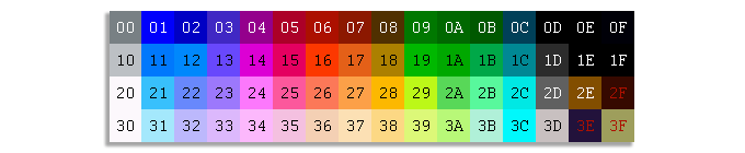
Firstly, how do you define what a palette is? You can think of it as the roadmap along a game's visual journey. For our purposes, it’s a limited set of colors that a game or computer program is allowed to use. Some retro consoles, like the NES, had a defined palette of 56 colors which could not be changed. Because of these limitations, games on particular platforms often have a unique color profile.
While this can lead to very distinct visual styles, we learned the hard way on Shovel Knight that you're also boxed into using color combinations that can be too high in contrast or unusual. It would have been nice to have had a palette with a smoother color ramp of dark to light tones, which the NES palette doesn't entirely provide. Smooth color ramps give you more control over your art. More control, hopefully, leads to a more cohesive visual aesthetic.
The NES color palette we used on Shovel Knight, with a few custom colors added for clarity.
In contrast to the NES's highly rigid palette, the Game Boy Color had a much larger pool of choices--over 32,000 different colors displayable (56 on screen at a time). This means we weren't technically forced into using a hardware-specific palette this time, which sounds like a good thing, right? But, ironically, even though the NES palette was a bit hard to work with, we found the self-imposed color limitations on Shovel Knight very freeing.
Color-limited palettes provide a solid foundation for the game's visual direction, so there's a practical use from a creative side, too! Using a palette helps establish a set of visual ground rules early in a game's development. It allows our art team to all be on the same page, and prevents us from getting too lost in the weeds when it comes to choosing colors. When you only have 3 blue hues to pick from, it makes the choice a simple one!
So, how did we resolve the conflict between hardware palettes being too restraining, but wanting to pare down our color choices to a balanced blend? We made our own!
CREATING A PALETTE
Again, with Mina the Hollower, our goal is to emulate the "feel" of playing a GBC game, not creating an actual one. We pored over some of our favorite portable titles trying to pinpoint what makes a GBC game look like a GBC game. While the palette might be technically vast, there are visual similarities between games which define the console.
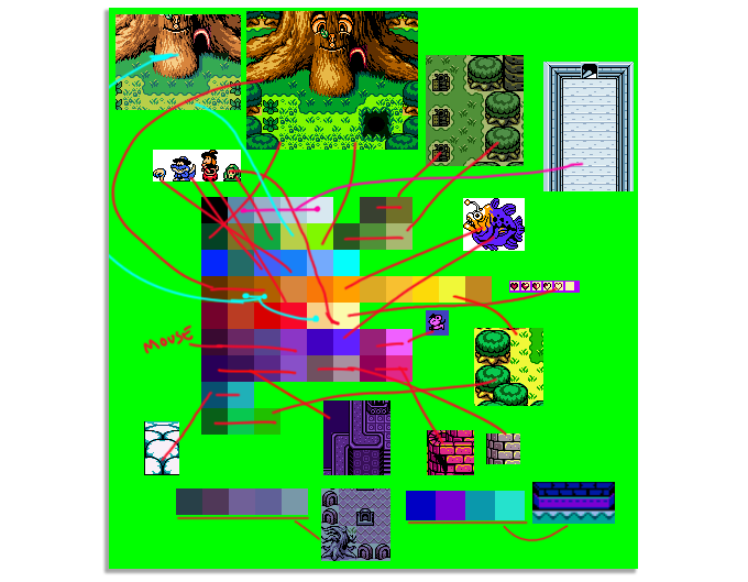
Choosing colors can be a messy process! The image above is one ugly example of us dumping all of our LEGOs on the floor and trying to pick out our favorite pieces before laying the brickwork for this epic adventure. It's a tedious job and requires a lot of iterating and tweaking. As we started working with the palette, we realized things we were missing or things that felt imbalanced. Ultimately, it's a process worth going through as it lays a strong foundation for the game's visuals moving forward. When your palette is solid, you can trust that you'll be viewing your game through a finely-tuned lens.

After a lot of iterating and combining like-colors into distinct gradients for ease-of-use, here’s the 64-color palette we came up with for Mina the Hollower! While still subject to change, we've managed to stick to it since the beginning of the game's production.
SPRITES
For character sprites, objects and interactables, we similarly aimed to pull colors largely from the GBC Zelda titles. The sprites in those games are bold, highly saturated and pop off the background, which helps to distinguish gameplay from set pieces.
![]()
Art assets in Mina the Hollower all conform to the Game Boy Color's palette restrictions, limiting sprites to only 4 colors per 8x8 pixel tile. That even includes black and transparency. This means sprites are generally limited to 2 colors.
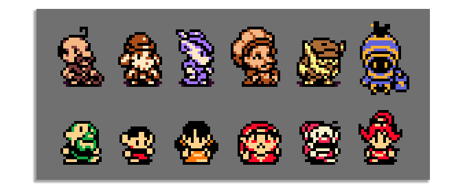
Top Row: Mina the Hollower | Bottom Row: The Legend of Zelda: Oracle of Seasons
It's common that character sprites in GBC games use the same highlight color across the board, which does a lot to define what a GBC sprite looks like in our memory. A specific off white color (seen above in the bottom row of sprites) is a particular signature of handheld Zelda game sprites. In Mina, we're making an effort to add some variety to the highlight colors we use to give each sprite a bit more uniqueness. Because we're not beholden to the same limitations, we're able to bend the rules in small ways while still playing to nostalgia.
![]()
Top Row: Mina the Hollower | Bottom Row: The Legend of Zelda: Oracle of Seasons
Exceptions to the 2 colors per sprite rule can be made when a sprite is subdivided along the pixel grid. Something like a big helmet or large weapon could get its own color as long as the separation happens within an 8x8 pixel space. Segmenting a sprite like this can also assist with readability, like when a large Boss ends up being one color, but their weapon is another. You instantly know what to avoid in battle.
CHARACTER PORTRAITS
![]()
Character portraits are always displayed on a black backdrop in Mina the Hollower, which means there's no transparency involved. In the examples above, you can see this means the art is able to afford one color more than in their sprite counterparts. That extra color is a useful means of sneaking in a little more detail, which is the goal when zooming into a character like this. Does the big art reflect the way you imagined these characters to look based on their tiny sprites?
TILESETS
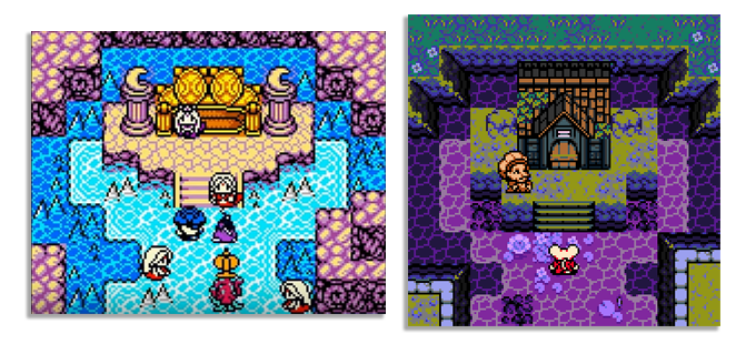
Left: The Legend of Zelda: Link's Awakening DX | Right: Mina the Hollower
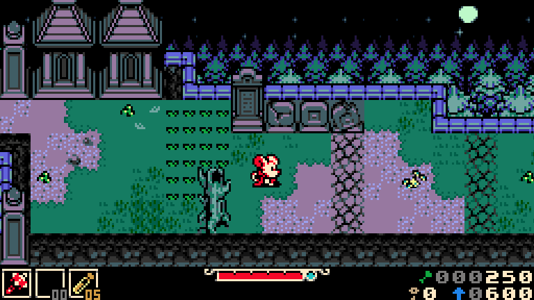
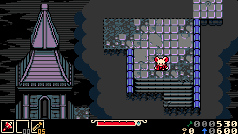
When tackling background tiles, our goal was to be intentional about choosing colors that accentuate the Gothic horror themes within the game. We made efforts to add a variety of cool, earthy tones to the palette intended to evoke a moody atmosphere. Hues you might find in the real world as opposed to the exaggerated and highly saturated ones you might see in a handheld Zelda game. Those colors are great, but they don't suit the spooky island setting in which Mina takes place. This choice allows us to place Mina in a world that feels grounded and immersive. Crypt walls feel cold and dank, while the bayou’s undergrowth looks lush and wild.
The early mockup above shows us using more saturated colors in our original test tileset. You can see the shift we made within the same zone (Nox's Bayou) as the visual style progressed. Making color changes to better suit the tone of the game wasn't the only justification though. Reserving saturated hues for sprites and gameplay objects, with which the player directly interacts, pops them to the foreground. As you can see in the second image, using color to separate gameplay objects from the environment keeps the player’s objectives focused.
Another benefit of the custom palette is that it sets images of our game apart from our inspirations at a glance! Link's Awakening DX makes liberal use of the yellow color shown above. You can see it used as a highlight within both the tileset and in the HUD. That yellow really defines the Link's Awakening DX aesthetic in our brains.
For Mina, we chose to stay away from using that yellow and integrate an eggshell color as our main highlight instead. While we're applying the same color restrictions per tile, it sets the visual identity of our game apart. We also feel it's a bit easier on the eyes.
In keeping with the macabre themes of Mina, we also chose to use black as the predominant color in our HUD, even though light-colored menus are ubiquitous on Game Boy.
Left: The Legend of Zelda: Link's Awakening DX | Right: Mina the Hollower
In our approach to rendering tile art, we made many considerations. Care was taken to add texture to each environment tile, carving in weathered and cracked patterns you might see in nature as opposed to some of the more abstract, geometric shapes often seen in GBC games. A couple of titles that did this particularly well are Survival Kids and Dragon Quest Monsters.
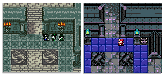
Left: Dragon Quest Monsters | Right: Mina the Hollower
In the example above, Dragon Quest Monsters use custom tile pieces to add variety to their wall tiles. Rather than repeating a singular wall pattern, they carved in detail befitting the nautical-themed setting. Foam is added to delineate between deep and shallow water tiles. Intricacies like these layer the space and keep the player's eye engaged.
Left: Dragon Quest 3 | Right: Mina the Hollower
Particular inspiration was taken from Dragon Quest III, which uses texture to accentuate the time-worn, lived-in feel of the environments. You gain a sense of history as you wander a fortress’s weathered stone halls. You feel the warm glow of town lights while wandering through a city at night. The many one-off, custom tiles found in Dragon Quest 3 add a rare level of detail. It makes it a game that does more with the limited hardware resources it had available than many others on the system. That attention to detail is something we're trying our best to infuse within Mina, wanting players to feel like they're exploring a world and not just a level.
WRAPPING UP
Great care is being taken to make Mina the Hollower look and feel as authentic to its inspirations as possible and remain a fresh and exciting new adventure. If you can imagine a timeline in which you visited your local game shop in the early 2000s and saw Mina the Hollower on a shelf next to your favorite handheld games of the era, we've done what we set out to accomplish.